
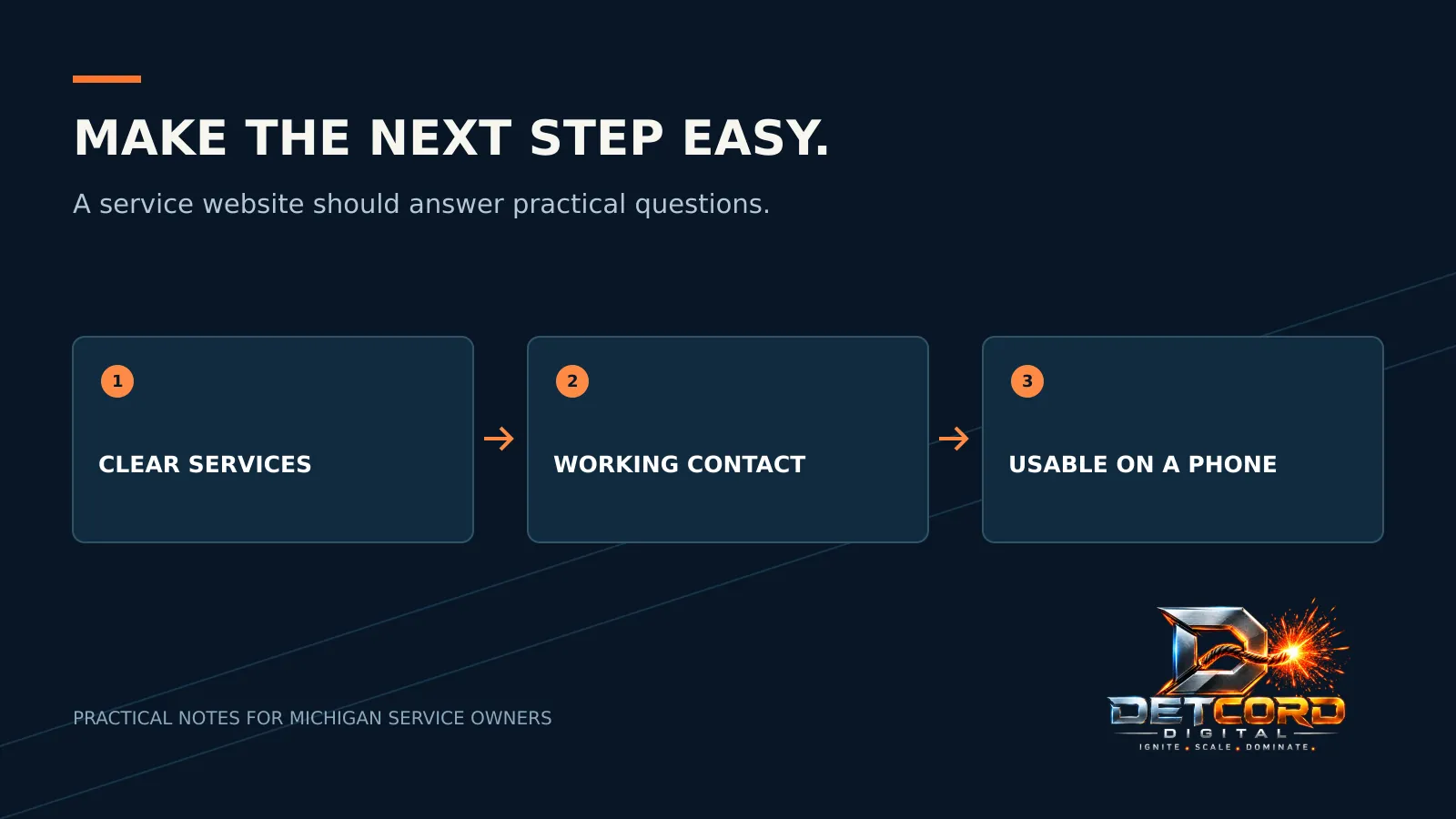
A homeowner with a leaking pipe or a cranky furnace has a few quick questions. Do you handle this? Do you serve their area? Can they reach you now? What happens after they ask? A website can look finished and still hide those answers.
Before you plan a redesign, walk through your site as a customer. Use your phone, not the desktop screen you see every day. Start where a customer would start and try to request service. Write down every spot where you hesitate, repeat a step or wonder if your request went through.
Put the useful details up top
Say what you do and where you work in plain words. Nobody should have to decode a slogan to learn whether you repair furnaces, install them or only do maintenance. If you serve one part of Michigan, describe that area honestly instead of pretending every nearby town has its own office.
Show your real hours, and separate office hours from emergency service. If after-hours requests go to a message or a callback list, say so. Don’t call yourself “24/7” just because a form works at midnight.
Test the phone number with your thumb
Tap the phone number on a real phone and check the number on the dialing screen before you call. Check the header, the footer and each service page too. An old number loves to survive in one corner after the contact page gets updated.
Give buttons and links enough room. Google’s web.dev guidance explains that tap targets need enough size and spacing so people don’t accidentally hit the one next to it. You don’t need a tech project to test this. If you keep hitting the wrong link while holding your phone normally, your customers will too.
Give each main service a real explanation
A service page should help someone decide whether their job fits. Explain the work, any limits, the area you serve and the next step. Use real photos only when you have permission. Nobody needs a long list of town names to understand a local service.
Be careful with big claims. “Licensed,” “insured,” “same-day” and “emergency” all have to be true for your business, today. Don’t leave old promises in a template just because they sound reassuring.
Test the whole form, start to finish
Send a clearly labeled test through your own contact form. Then check where it arrived, what the confirmation said and who’s supposed to answer it. A friendly “thanks!” on the screen doesn’t prove your office got the request. Check the receiving end.
Ask only for what you need right now. A short description, the service address and the best way to reach them may be enough to start. Don’t invite customers to send card numbers or sensitive records through a general form. And don’t promise a response time your team can’t keep.
Treat speed as part of the experience
Open your main pages on the kind of phone and connection your customers use, including cellular data, not just your office Wi-Fi. Watch for a slow top image, a button that jumps as you tap it or a menu that covers the phone number. Write down what you see. Big images, extra scripts and clunky layouts are things a developer can fix from those notes.
A speed score alone won’t tell you if your service description is right or if the phone reaches the right person. A fast page still needs clear words, readable text and a contact path that works.
Start with the biggest obstacle you found and fix that first. For more, read why your website gets visitors but no calls and how fast a small business website needs to load. If you’d like help, see our web design and development service or explore Get Chosen, and bring the spot where your contact path gets confusing.
Sources: web.dev: Accessible tap targets, web.dev: Performance audit prework.



 Web Design & Development